Case study · Barbering and grooming · London
Industrial Barbers
A barbershop that pops up inside flexible workspaces in six cities from London to Dublin, and a one-page site built to walk a manager to the enquiry form.
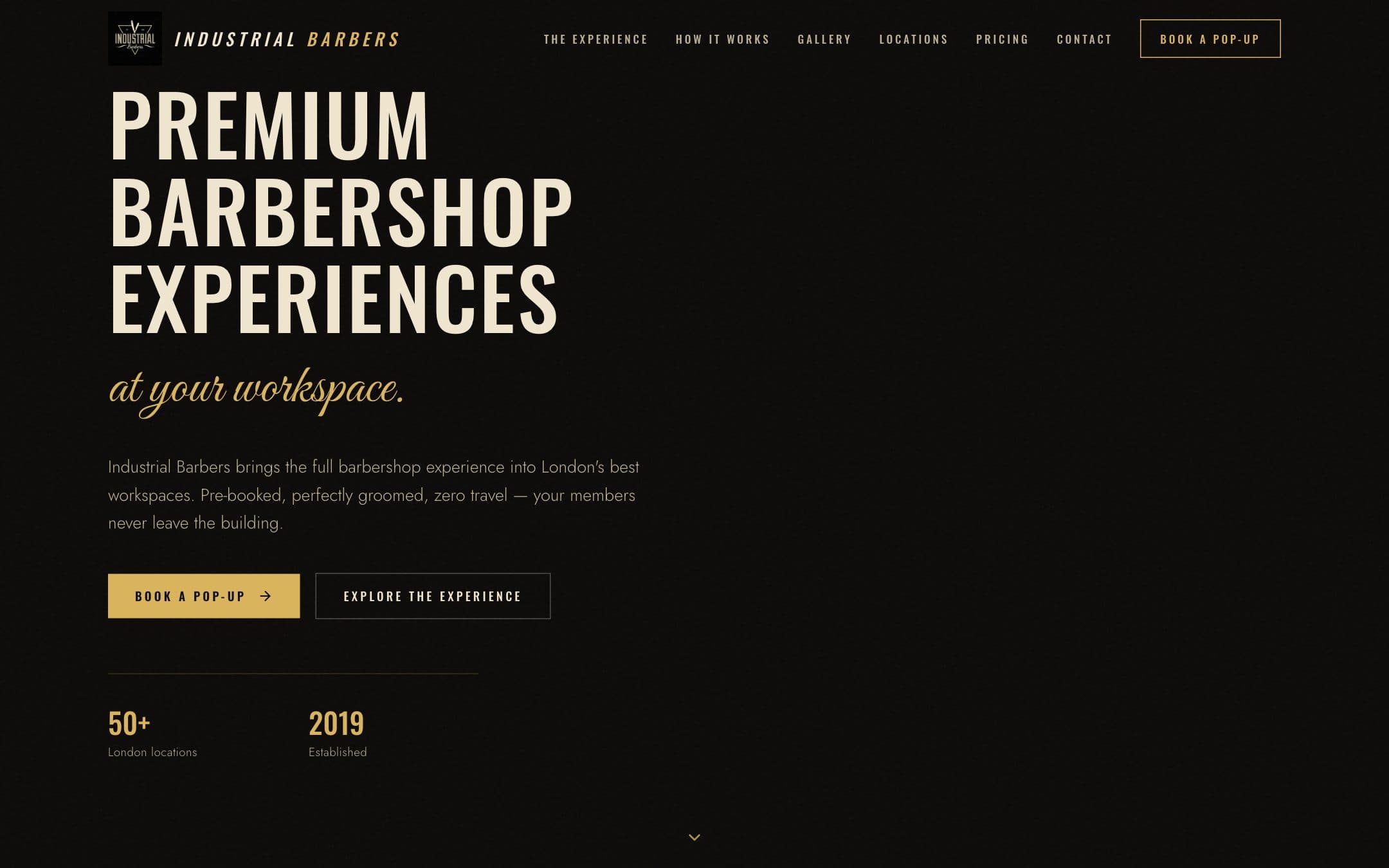
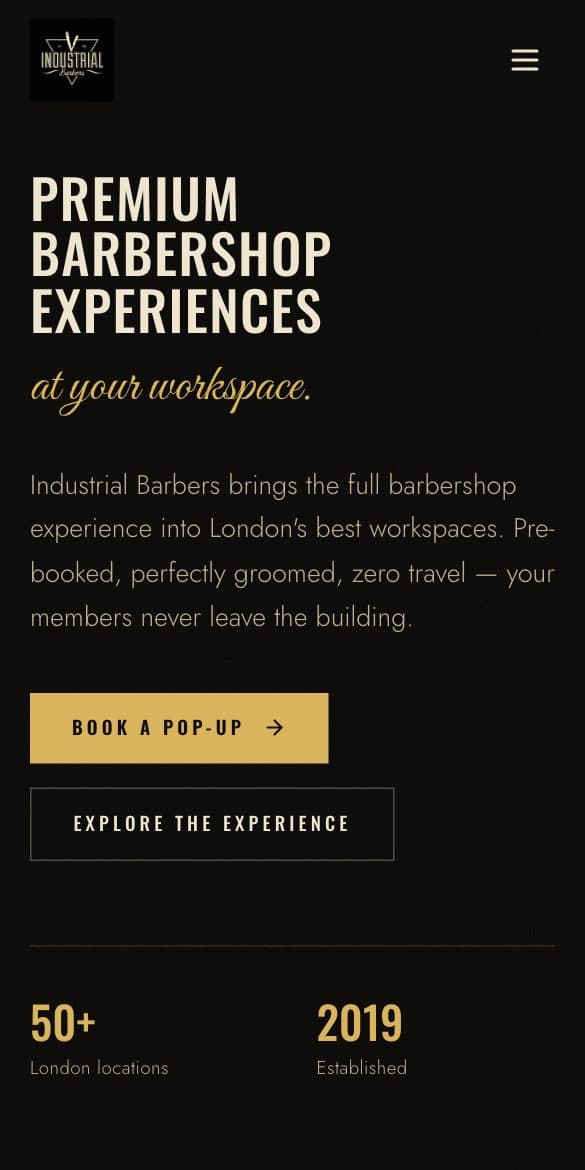
The brief
Industrial Barbers brings the barbershop to the office. Founded in 2019 by Chris Austin, the company sets up a full barbershop in a workspace's communal area, as a monthly residency or a one-off event day, and handles the member bookings itself. The workspace pays one flat day rate, cuts are free for members, and each event day runs 12 to 16 pre-booked 30-minute appointments. Industrial Barbers counts more than 60 locations across Europe: WeWork, GPE and Mindspace buildings in London, Manchester, Edinburgh, Cambridge, Paris and Dublin.
The brief had two audiences and one goal. Workspace managers needed to understand the offer quickly, see the price without asking, and have a short route to booking a first event. Members needed to see what a residency day looks like and how to claim a chair. There is no fixed shopfront, so the website does the front-of-house work, and every section had to point at the same place: the enquiry.
What we built
We built Industrial Barbers a single long page and the enquiry flow behind it. The navigation is six anchors: locations, the experience, how it works, gallery, pricing and contact, plus a gold Book a Pop-Up button that goes straight to the form.
The enquiry is the spine. A marquee of workspace operator names runs under the hero. Below it, a locations browser groups residencies by network. Tap WeWork, GPE or Mindspace and the tile expands into a list of buildings with area names, split into city tabs where a network spans more than one city, so a manager can check their own building. The story section explains the model in three lines and is signed by Chris Austin as founder. Pricing is two stacked cards: a full event day from 10am to 4pm with everything included listed beside the price, and below it a shorter trial event from 10am to 2pm, both with buttons that lead to the form. How it works walks from enquiry to event day in four numbered steps.
Members and managers get different routes. The contact section carries a Members link that reads Book your chair via Instagram DM. Managers get the enquiry form: workspace, building, name, email, phone, preferred date and a message box. It posts them as named fields to a small serverless endpoint on the same domain, so an enquiry arrives structured rather than as one block of text. The copy beside it says Industrial Barbers will come back within one working day.
The details that mattered
The trial event button does more than scroll. Tapping Book trial jumps to the contact section and pre-writes the message box with a request for a trial event, price and hours included. The event day button does the same for a full day. The manager adds their workspace, name and email and sends.
The form fails politely. While sending, the button shows a spinner and the word Sending, with a screen-reader announcement to match. If the send fails, an alert says so and gives a direct email address, so no enquiry dies on an error screen. Success shows Looking sharp already over animated barber stripes. If the app itself has not rendered after six seconds, a plain script writes an apology and the same email address into the page.
The locations figure at the top of the browser counts up, and each network tile carries its own accent: gold for WeWork, cream for GPE, orange for Mindspace. Tapping WeWork opens city tabs. GPE and Mindspace are London only, so they open straight onto their buildings.
The look is ink and coal with hairline gold borders, square-cornered cards and buttons, and a film grain across the page. Barber-pole stripes sit as a static rule on the pricing card and footer and animate only once an enquiry has been sent. Headlines are condensed uppercase with wide letter spacing, sized to the viewport so they hold their proportions from a phone to a widescreen monitor, and every animation stands down for anyone who has asked their device for reduced motion.
The page carries little weight. The gallery is a masonry grid of lazy-loaded photographs from the pop-ups, two columns on a phone and three on a large screen. Page views are counted by a single first-party beacon rather than a third-party script, and spam is caught by a hidden honeypot field rather than a captcha. The small print under the form says details are used only to reply to the enquiry, never shared and never spammed.
Want one like this for your business?
A free demo first, with your content. Then a firm price in writing.
Or call 07438 284755 or email luke@owntimestudios.com.